Business News
A Fresh Start for a Strong Brand

Friday 06. June 2008 - manroland shows independence in its external appearance as well.
For more than 160 years manroland has developed and built printing presses. The company today is the global market leader for web presses and a close second for sheetfed presses. All over the world, every third newspaper sold is produced on a manroland press. To ensure that this success story continues in the future, the manroland brand has decided to make a fresh start in 2008.
Independence in 2006 already provided the basis for a fresh start. This radical change enabled manroland for the first time to focus its efforts exclusively on the print market without any constraints. With the changes made to the Corporate Design the company shows its new orientation and optically indicates its independence. It was not simply a matter of cosmetic changes. The entire brand was taken apart, rearranged, and put back together as a new entity within the traditional costume. The most important steps along the way to the new Corporate Design:
New brand values.
The start was made by realigning the values of our brand, retaining all the positive experiences our customers have had with manroland for so many years. We want to be reliable and groundbreaking, but also incorporate new experiences we have learned during the short time we have been independent. We want to be determined and inspirational. These are values that will characterize our dealings in the future and embody our increased corporate latitude: Our brand core experience: manroland, the high-performance business partner.
New logo.
Building on the strong awareness and the great respect the brand enjoys, a dynamic word brand has been developed. With modern typography and a purposeful color scheme in gray and blue, this word brand harmoniously combines tradition and innovation. Moreover, for the first time, the names of the companies that merged in 1979, MAN and Roland, are incorporated in the form of our new name. Not separated, and equal: manroland. In the logo, the respected and internationally known brand name has been rejuvenated in its typography and color scheme. The logo is the principal element of our appearance and – followed by the claim WE ARE PRINT – an essential image bearer. The new manroland logo is a word brand with optical emphasis on the “o”, symbolizing the globe and also inferring the shape of a printing cylinder. This makes manroland also optically what it is: the Global Player in printing.
New layout.
Printing is the art of applying color to a substrate so precisely and in such perfect register that the expression and power of thoughts, words and illustrations are enhanced. The new manroland layout follows this philosophy in a unique manner. The idea behind the layout is based on a control strip that printers use to achieve perfect color balance during printing: the media wedge. Together with the logo and the house colors manroland blue and manroland gray, the manroland media wedge, also in specially defined house colors, forms the basis for the design of all manroland communication media. Here the media wedge can be depicted in full or parts of it can be separated and used as design elements.
New advertising media.
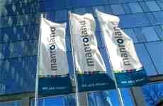
The new appearance will be rigorously applied in all media. From flags and banners to new ads and posters, manrolands new look is everywhere. “This will start at drupa with ads and posters that communicate our new name and logo. Here we focus on two fundamental strengths of our company: Tradition and Innovation. In a second phase, image themes will follow that reflect our new self-confidence and
make it clear that we are the benchmark in Print,” explains Thomas Hauser, Executive Vice President of Corporate Marketing and Communications at manroland, adding: “a relaunch of our product brochures was also especially important for us. Besides the design as such, we have concentrated on clear structuring of the contents.”
A fresh start.
manroland is known as a high-performance and reliable partner for printing systems and printing solutions. The new appearance confirms this positive image. It conveys strength and determination, and its aesthetics go beyond traditional press building, proving our strong identification with the printing industry and our enthusiasm for it. The first public presentation in the new Corporate Design will be at drupa 2008. It is the foundation stone for a successful future. The redeveloped Corporate Design is a stable platform for a modern, creative and impressive appearance with which manroland will substantially differentiate itself from its competitors.
