Prepress
2024 The Year of Calm
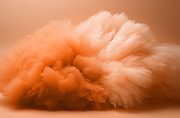
Wednesday 10. January 2024 - With Viva Magenta the emphasis was on signalling strength and writing a new narrative. This year the focus is on an innate yearning for closeness and connection. Peach Fuzzs radiance, warmth and modern elegance resonates with compassion.
By John Blyth, Marketing & Communications Manager, Ricoh Europe
What does 2024 look like to you? According to numerous proponents of ‘colours of the year’ the emphasis over the next 12 months is on calmness and kindness.
Pantone has picked Peach Fuzz 13-1023 to provide the tonal backdrop for the coming year. Conjuring up an air of calm, the warm and cozy shade highlights our desire for togetherness with others or for our enjoyment of a moment of stillness and the feeling of sanctuary. It also inspires belonging, recalibration, and an opportunity for nurturing. Pantone says it is an idea, as much as a feeling and awakens our senses to the comforting presence of tactility and cocooned warmth. It is also quietly sophisticated and contemporary, bringing beauty to the digital world.
The velvety peach tone, whose all-embracing spirit enriches mind, body, and soul, is a mood shift from last year’s Viva Magenta 18-750 which was described as the unconventional shade for an unconventional time.
With Viva Magenta the emphasis was on signalling strength and writing a new narrative. This year the focus is on an innate yearning for closeness and connection. Peach Fuzz’s radiance, warmth and modern elegance resonates with compassion. It offers a tactile embrace to invoke the feeling of kindness and tenderness.
Dulux also chose a shade that it says is a kind, delicate tone. Its colour of the year – Sweet Embrace – brings a feeling of positivity to our lives. Valspar selected Renew Blue as a shade that, too, evokes a feeling of calm and balance while encouraging self expression. Wallpaper specialist Graham and Brown’s Viridis intends to facilitate a calming refuge away from the hustle and bustle of everyday life.
The power of colour to impact our feelings and shape our moods is well documented. In fact, artist Pablo Picasso used colours to show his good and bad moods in his paintings and he is reported to have said: “Colours, like features, follow the changes of the emotions.”
Colour affects our ability to remember information as well. Red performs the best, black the worst.
It also plays a crucial role in our connection with brands with up to 90% of an initial impression attributed to colours alone. 93% of people will also decide to buy a product because of its colour.
If these expert picks are anything to go by in terms of what we should expect to see dominating the palette for the coming year, 2024 could be shaping up to be a tranquil and soothing year.
To help bring some of that zen into your production printing environment are the latest additions to Ricoh’s colour sheetfed portfolio. For example, the Ricoh Pro C7500 can produce a broad colour palette with gold, silver, neon yellow, and neon pink toners. Its built in new neon colour profiles can automatically add neon yellow and neon pink to expand the colour gamut for richer and more vivid colour expression. Furthermore, new custom spot colours can be created using CMYK and a fifth colour and, very importantly, valued added print can be created more easily and pantone colours can be matched more accurately using Fiery Spot Pro or Premium. With Color-Logic software and Touch7’s Extended Colour Gamut system expanded colour capabilities are easily delivered.
Let us help you make sure that, as the experts suggest, 2024 is a year of calm for you too.