Consumables
Meet the minds behind the Fedrigoni 365 calendar designs
Tuesday 09. March 2021 - The powerful impact of the Fedrigoni 365 calendar would not have been possible without the creative submissions from almost 1,000 designers. We spoke to five creatives about their views on the project, the process and the outcome:
1. Ralph Solly
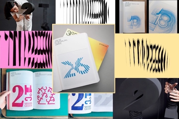
The 2021 brief was different to previous editions I had been involved with. I was given the number 26 and my seed word of carve. Before lockdown, I had visited Bridget Rileys exhibition at The Southbank Centre, and I was inspired by her optical art, as well as by Josef Albers for his linocut work. After some initial sketches, I wanted to create an abstract number using the medium of linocut, a skill I had never tried. I experimented with two designs, the result, a hand carved design made of 13 shapes per number to make up 26.
Every year the Fedrigoni 365 book brief changes a little bit, which adds to the challenge. Every year there are new paper stocks, finishes and neon inks used. The 2021 version is unique and limited edition, making it extra special and poignant after such a tough 2020. Print is very much still alive, people crave tactile and tangible, and after a year where touch and sensation has been limited, the finishes on Fedrigoni 365/2021 have exceeded my expectations. Ricoh has pushed the boundary again. This book is always produced differently, so my next submission may be more experimental and bold.
2. Vincenzo Marchese Ragona
Last year, with a couple of friends, I had the luxury of visiting the printer that produced the Fedrigoni 365 (2019/20) edition. I think the project is an amazing opportunity to bring hundreds of artists together and I definitely wanted to be part of this reality. I was assigned the number 18 and seed word digital. While creating my submission I tried to think about how a machine would mimic neurons and electrical pulses. The aim was to keep it as organic as possible yet unnatural, digital, manmade. I used some particles and influenced them using a force field on 3D software. I like animations so my design was obviously animated. I wanted people to enjoy it in its fullness, so I used an app called ArtiVive to overcome the printing “static” limitation. If you scan my artwork it will come to life.
I think the 2021 edition was incredibly ambitious. The fact that each copy is randomly generated really adds an extra level of care. Every designer has a copy with their name on the first page – how cool is that? I am always interested in finding new ways we can use technology to make design more engaging. This is definitely a brilliant execution of what is achievable with the right tools (and brains).
3. Malena Ramírez Silvestre
Before Helena Santacana and I set up ESCOLA, a graphic design studio based in Liverpool and Barcelona, we worked as graphic designers with creative studios. It was then we first had the opportunity to produce stationery and packaging using Fedrigoni paper. When we saw the open call to be part of the calendar, we applied straight away. It was a brilliant opportunity for us for numerous reasons. Firstly, our work would be in a lovely and unique book with many talented designers. Secondly, it was the best opportunity to do a personal project, being away from the screen and experimenting with other techniques.
We were assigned the number 23 and seed word stretch. When we were discussing some of the conceptualisations we realised we were repeatedly using the same gesture and wanted to represent it. We found using a spring ideal for joining and separating two parts of the numbers and defining the word allocated. To bring the idea to real life, we worked with creative workshop Areski. We decided to work in black and white with high contrast on the images. Theresult is impressive. The calendar has shown us the incalculable possibilities of Ricohs technology and it will be a great reference for future projects.
4. Lucy Parker, Alphapress
Being a packaging designer by day, I am particularly familiar with Fedrigoni boards. This has given me personal appreciation for the nuances of the wider collection and encouraged me to also bring them into my side hustle as a letterpress artist. My number was 21 and my seed word heat. My immediate thoughts went to temperature. I have always had a love for glyphs and their clever way of being readable through a minimal symbol, so I added a degree and tilde lines to indicate heat. The print was digitally designed and then traced, cut and carved out of lino. This was then relief printed onto Fabriano paper.
Ive been stunned by the complexities and variations from print to print. The uniqueness of each finish gives a different tone, and final impression to the individual pieces, and I found that even looking at my own design, from one book to the next, the imagery and sense of heat changed which I loved. In my job I work primarily with offset printing and seldom have the opportunity to work with digital printing. This experience has exposed me to new possibilities of digital print and the quality has been outstanding. I have never seen a print run with such stunning variations from book to book and Im excited to see what Ricohs technology brings next.
5. Fran Mendez
Four years ago we at Stupendous Studio came across a Fedrigoni social media post looking for creatives in the UK interested in taking part in a charitable project. We were extremely excited about the opportunity of being part of something that involves design and a good deed. We were given the number 19 and seed word pull. We wanted to create an image evoking movement and dynamism. It turns out that even when pulled apart, everything stays together. We created an interactive graphic piece that can be pulled and transformed into numerous variations allowing us to create unique graphical versions from the same design.
The partnership between Fedrigoni and Ricoh open new opportunities for designers, offering more flexibility when creating. The output showcases Ricohs print capability to handle colour variations to a high standard making it possible to realise the design vision. Projects can be more ambitious as print capabilities are stepping up to match consumer needs and expectations. These new possibilities in printing technologies will allow us to push projects beyond traditional constraints. Want to learn more about how you can make your print more creative push it beyond traditional constraints? Talk to us.